Appearance
DataFrames & Visualising Data with Plots
Reading
Resources
Overview
This week we learn how to work with data frames and how to visualise data effectively. To analyse data, we first need to shape it into a useful form—this is where data frames shine. Once the data is tidy, we explore it with plots to spot patterns and draw defensible conclusions. We’ll also discuss how to choose the right plot for the job and how to label it clearly so readers don’t misinterpret the message.
The best way to learn is by doing. Skim the readings, then implement the examples. If time allows, find a small dataset of your own and try the same operations.
Data Frames
Tables are a natural way to organise data: columns hold variables, rows hold observations. A clean convention is to keep one variable per column (e.g., Name, Age, Height) and one observation per row.
Example dataset:
| Name | Age | Height(cm) | Occupation | Id |
|---|---|---|---|---|
| Taariq Nazar | 26 | 187 | PhD | 0 |
| Someone Cooler | 27 | 188 | Professor | 1 |
| Someone Even Cooler | 28 | 189 | Emeritus | 2 |
| Someone so cool | 26 | 179 | Plumber | 3 |
A tabular dataset like this is a data frame. In this example, there are four observations and five columns (we often don’t count Id as a variable unless it’s meaningful for analysis). A core skill in this course is operating on data frames to select, reshape, summarise, and combine data.
Core operations
Get comfortable with these five verbs, then compose them to build complex pipelines:
- Sorting — order rows by one or more variables.
- Selecting — choose a subset of columns.
- Filtering — keep rows that satisfy a condition.
- Mutating — create new columns from existing ones.
- Grouping (often with summaries) — aggregate by one or more keys.
Below are minimal patterns in Python (pandas) and R (dplyr).
Python
import pandas as pd

# Example data frame
data = {
    "Name": ["Taariq Nazar", "Someone Cooler", "Someone Even Cooler", "Someone so cool"],
    "Age": [26, 27, 28, 26],
    "Height_cm": [187, 188, 189, 179],
    "Occupation": ["PhD", "Professor", "Emeritus", "Plumber"],
    "Id": [0, 1, 2, 3]
}
df = pd.DataFrame(data)

# Sorting by height (descending)
df_sorted = df.sort_values("Height_cm", ascending=False)

# Selecting a subset of columns
df_selected = df.loc[:, ["Name", "Age", "Height_cm"]]

# Filtering rows (Age > 26)
df_filtered = df.loc[df["Age"] > 26]

# Mutating: Body Mass Index from existing columns (example with made-up weights)
df["Weight_kg"] = [78, 82, 85, 76]
df["BMI"] = df["Weight_kg"] / (df["Height_cm"] / 100) ** 2

# Grouping + count per age
counts_by_age = df.groupby("Age", as_index=False).size().rename(columns={"size": "n"})
R
# dplyr makes data-frame verbs consistent and composable
library(dplyr)
library(tibble)

df <- tibble::tibble(
  Name = c("Taariq Nazar", "Someone Cooler", "Someone Even Cooler", "Someone so cool"),
  Age = c(26, 27, 28, 26),
  Height_cm = c(187, 188, 189, 179),
  Occupation = c("PhD", "Professor", "Emeritus", "Plumber"),
  Id = c(0, 1, 2, 3)
)

# Sorting by height (descending)
df_sorted <- df %>% arrange(desc(Height_cm))

# Selecting a subset of columns
df_selected <- df %>% select(Name, Age, Height_cm)

# Filtering rows (Age > 26)
df_filtered <- df %>% filter(Age > 26)

# Mutating: BMI from existing columns (example with made-up weights)
df <- df %>% mutate(Weight_kg = c(78, 82, 85, 76),
                    BMI = Weight_kg / ( (Height_cm/100)^2 ))

# Grouping + count per age
counts_by_age <- df %>% count(Age, name = "n")
Tip: When pipelines get long, break them into named steps (variables) or add comments like “# 1) select”, “# 2) filter”, etc.
Visualising Data: Plots
A plot can reveal structure that’s hard to see in tables—trends, clusters, outliers, and relationships. The goal of a plot is to help a reader reach a clear conclusion without ambiguity, so always add informative labels and, when appropriate, a brief caption.
Choosing the right plot
Match the plot to the question and variable types:
- Distribution of one variable: histogram, density plot, boxplot/violin.
- Relationship between two numeric variables: scatter plot (optionally with a smooth line).
- Comparison across categories: bar chart (counts) or point/line with error bars (summary stats).
- Change over time: line chart (time on the x-axis).
- Composition: stacked bar (few categories), small multiples when many.
Example: plotting a function
A computer can’t plot a truly continuous curve; we approximate with many points
Python
import numpy as np
import matplotlib.pyplot as plt

n_steps = 1000  # number of x-points
x = np.linspace(0, 2*np.pi, n_steps)
y = np.sin(x)

plt.plot(x, y)
plt.xlabel("x")
plt.ylabel("sin(x)")
plt.title("Line chart of sin(x)")
plt.show()
R
library(ggplot2)
library(tibble)
library(dplyr)

n_steps <- 1000
x <- seq(0, 2*pi, length.out = n_steps)
y <- sin(x)

# It’s convenient to work with data frames
df <- tibble(x = x, y = y)

df %>%
  ggplot(aes(x = x, y = y)) +
  geom_path() +
  labs(title = "Line chart of sin(x)", x = "x", y = "sin(x)")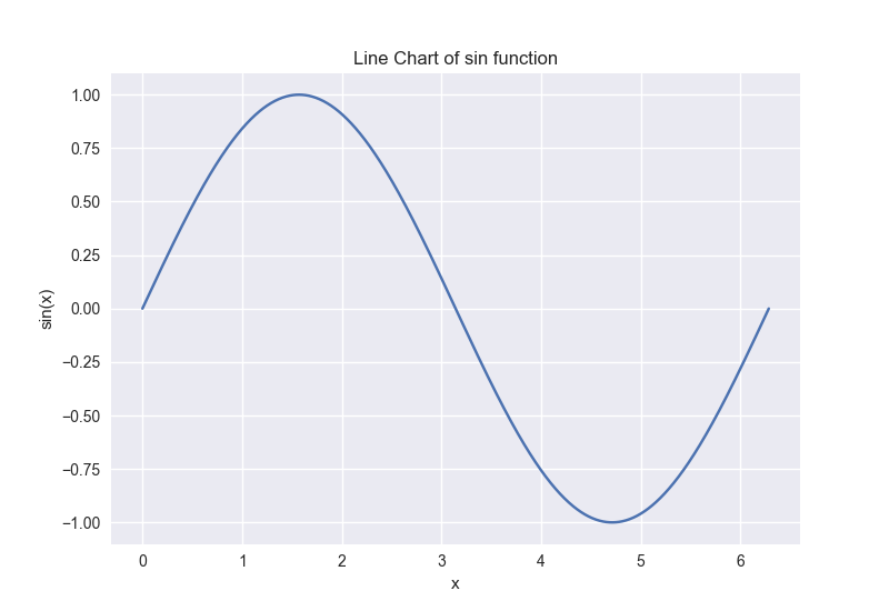
Example: bar chart from a data frame
Let’s visualise medal counts for the top three countries in a dataset Winter_medals2022-11-03.csv.
Python
import pandas as pd

# Read and prepare
df = pd.read_csv("./data/Winter_medals2022-11-03.csv")
top3 = (
    df[["Country", "Total"]]
    .groupby("Country", as_index=False)
    .sum()
    .sort_values("Total", ascending=False)
    .head(3)["Country"]
)

agg = (
    df.loc[df["Country"].isin(top3), ["Country", "Gold", "Silver", "Bronze"]]
      .groupby("Country", as_index=True)
      .sum()
)

# Plot (stacked horizontal bar)
ax = agg.plot.barh(stacked=True)
ax.set_xlabel("Medals")
ax.set_ylabel("Country")
R
library(readr)
library(dplyr)
library(tidyr)
library(ggplot2)

df <- read_csv("./data/Winter_medals2022-11-03.csv")

top3 <- df %>%
  group_by(Country) %>%
  summarise(Total = sum(Total), .groups = "drop") %>%
  arrange(desc(Total)) %>%
  slice_head(n = 3) %>%
  pull(Country)

agg <- df %>%
  filter(Country %in% top3) %>%
  group_by(Country) %>%
  summarise(Gold = sum(Gold), Silver = sum(Silver), Bronze = sum(Bronze),
            .groups = "drop")

agg %>%
  pivot_longer(cols = -Country, names_to = "Medal", values_to = "Count") %>%
  ggplot(aes(x = Count, y = Country, fill = Medal)) +
  geom_col() +
  labs(x = "Medals", y = "Country")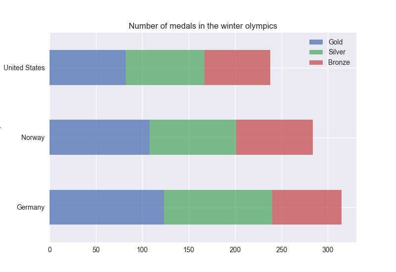
Common pitfalls
- Unclear labels/captions → Always label axes, units, and variables; add a one-line caption for context.
- Overplotting → Use transparency, jitter, hex/bin plots, or sample down when points overlap.
- Mismatched plot type → Choose plots that match the variable types and the question.
- Invisible assumptions → If you filtered or transformed data, say so near the plot (e.g., “top 3 countries by total medals”).
Quick practice
- Load a small CSV of your choice, compute a new variable (mutate), and plot its distribution, see link for data.
- Filter to a subset (e.g., a few categories) and compare means with a bar chart or point-range plot.
- Create a grouped summary and plot it as small multiples or a stacked bar.